

Presentations
Everything you need for a great deck
The North template gives you ready layouts in light and dark, set in our type and colours, so you can spend your time on the story rather than the formatting.
The template is 16:9 (1920×1080). Backgrounds are locked artwork; every text box is editable. Install Helvetica Now before you start; if it is missing, PowerPoint falls back to Arial and line breaks will change.
Layouts



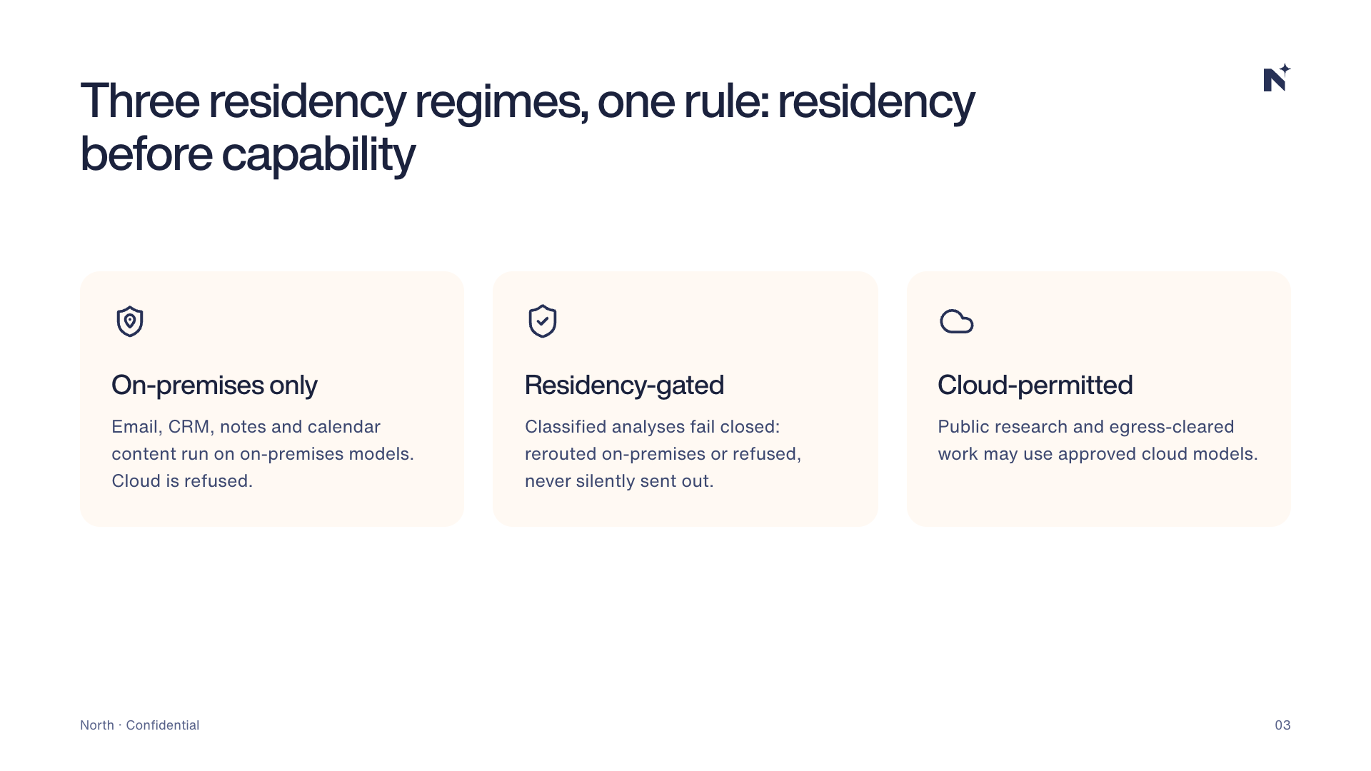
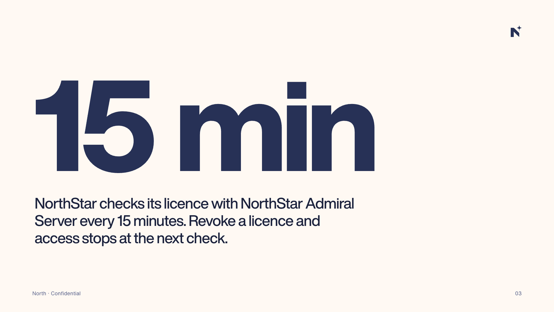

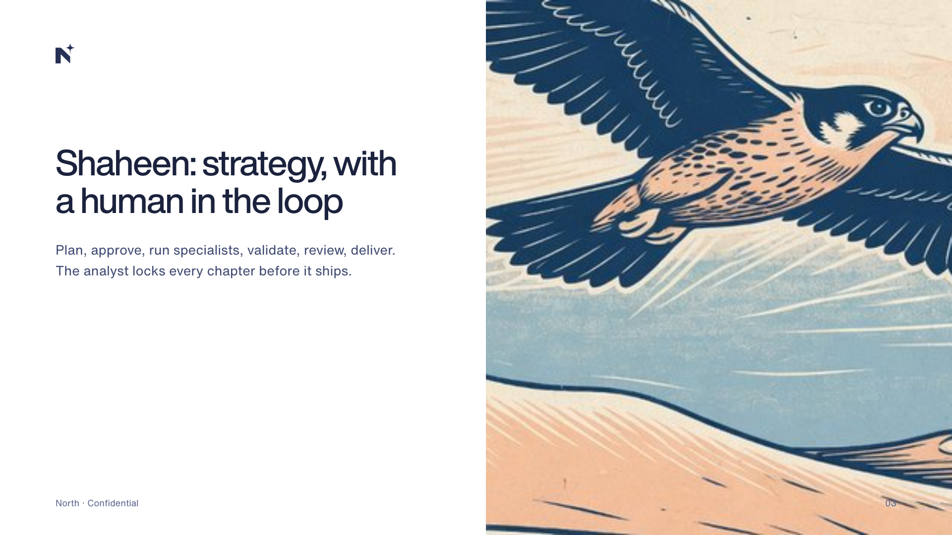
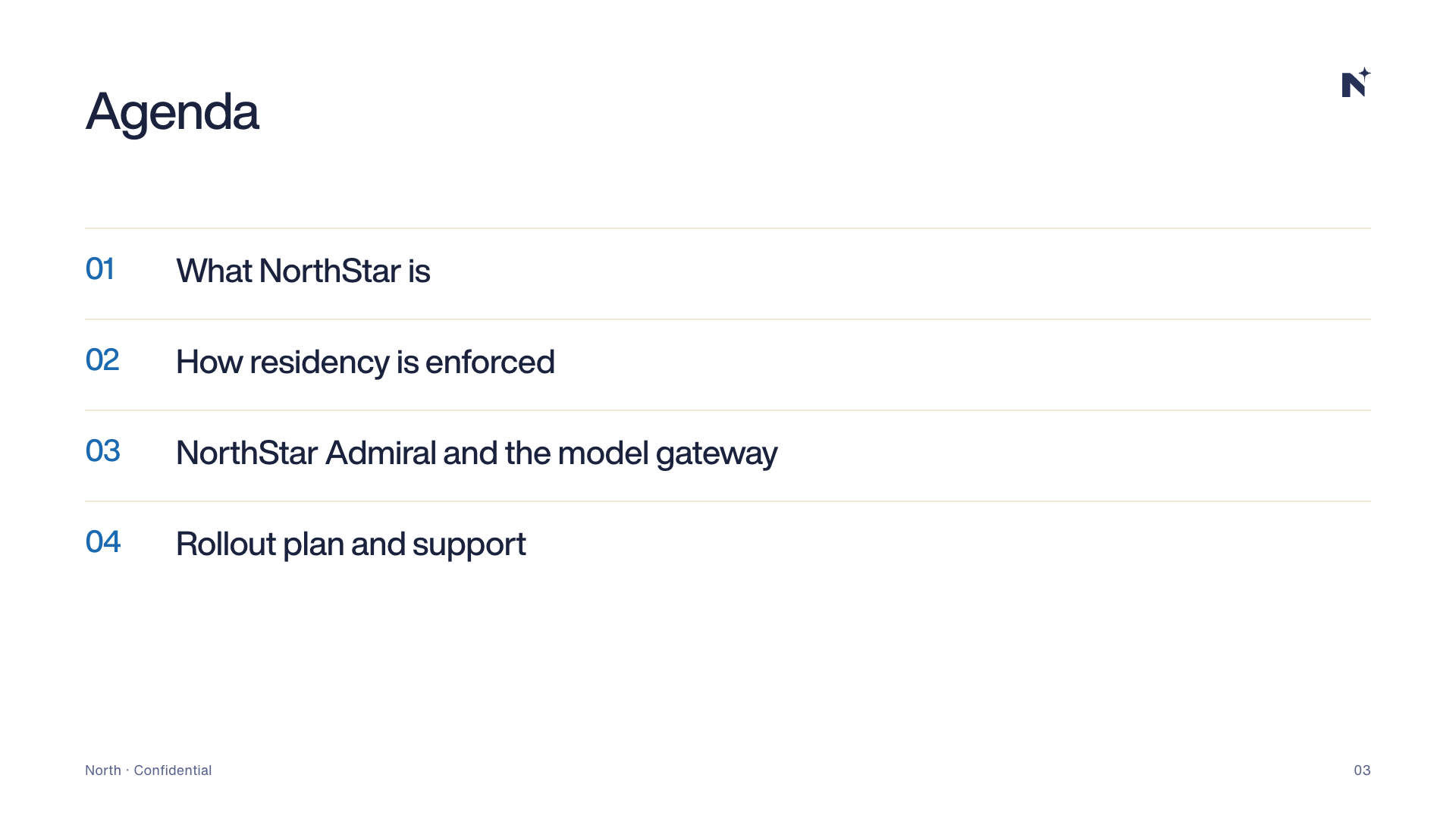
Light or dark?
| Deck | Cover | Body slides | Dividers |
|---|---|---|---|
| Customer and partner decks | Aurora | Light | Midnight |
| Government briefings | Aurora | Light | Midnight |
| Technical and architecture | Night | Light or dark | Midnight |
| Keynotes and events | Night | Dark | Midnight |
| Internal updates | Aurora | Light | Optional |
Writing slides
One idea per slide
- Write the title as the takeaway: “Data never leaves the building”, not “Data residency”.
- Three points maximum. A fourth point is a new slide.
- No paragraphs. If you need them, you need a document.
- Big numbers beat charts when one figure carries the story.
- Speaker notes hold the detail.
Type and colour on slides
| Element | Style | Size at 1920×1080 |
|---|---|---|
| Cover title | Display Bold, −0.025em | 120–128pt |
| Slide title | Display Medium | 64–68pt |
| Body | Text Regular | 24–28pt (never below 18pt) |
| Big number | Display ExtraBold, −0.05em | 300–440pt |
| Footer | Text Regular, Midnight 50 | 14–18pt |
Text is Midnight 90 on light slides and Snow on dark slides. Use Gulf 70 for the one word or number that must stand out on a light slide, Oasis on dark.
Logos on slides
- Covers and the closing slide carry the full North logo or the sub-brand lockup.
- Content slides carry only the icon, top right.
- Partner logos go on a dedicated slide or the cover, following the co-branding rules.
- Never paste a logo from a website or screenshot; use the files from the hub.
Dos and don'ts
Do
- Start every deck from the template.
- Keep one idea per slide.
- Use library illustrations and real product screenshots.
- Check that the deck reads well as a PDF.
Don't
- Change the master backgrounds or fonts.
- Use stock clip art or other brands' templates.
- Cram text: if it needs 14pt, it is a document.
- Add slide transitions beyond a simple fade.
Last updated on 14 October 2026