

Gradients and patterns
Light, not decoration
Our gradients are skies, not effects. Each one describes a time of day over the desert, and each has a job.
Aurora
Sunrise to sea
Aurora is our signature gradient: Dawn peach in one corner, Oasis aqua and Gulf blue in the others, warm Dune in between. It comes from the North app icon.
- Covers, title slides and hero sections in light mode
- App icons and splash screens
- Behind the Midnight logo or one strong headline
Build it from soft radial glows, as in the supplied artwork, rather than a flat linear blend. One Aurora per layout.
Horizon
Night to water
Horizon runs from Midnight through Gulf to Oasis. It is the product gradient: thin bars, progress indicators, the top edge of a document, dividers on dark. It was first used in the NorthStar Help Center header.
- Use it in thin strips (2–8px) or small areas
- Never behind body text
- Never as a full-page background
Night
Quiet depth
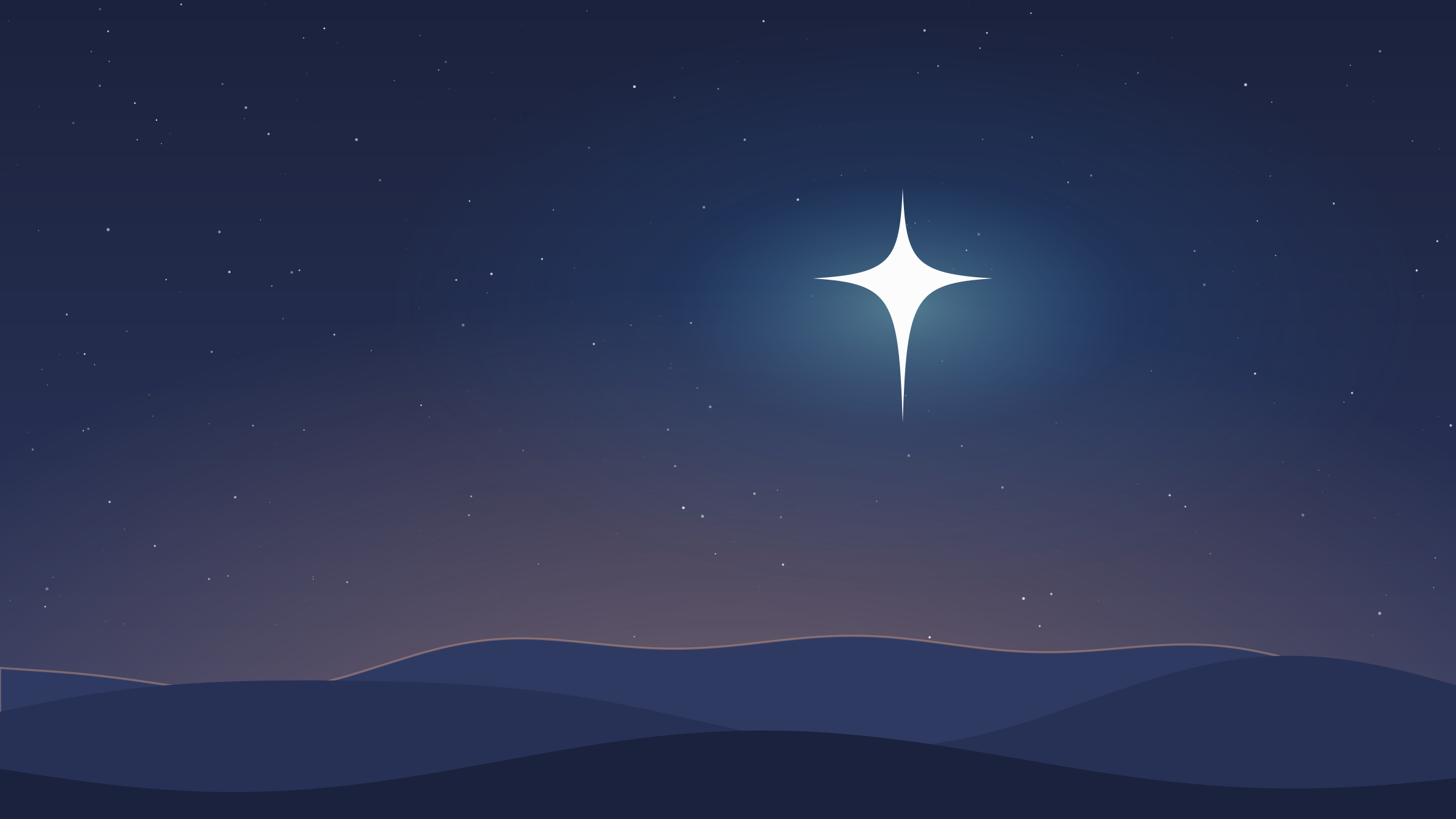
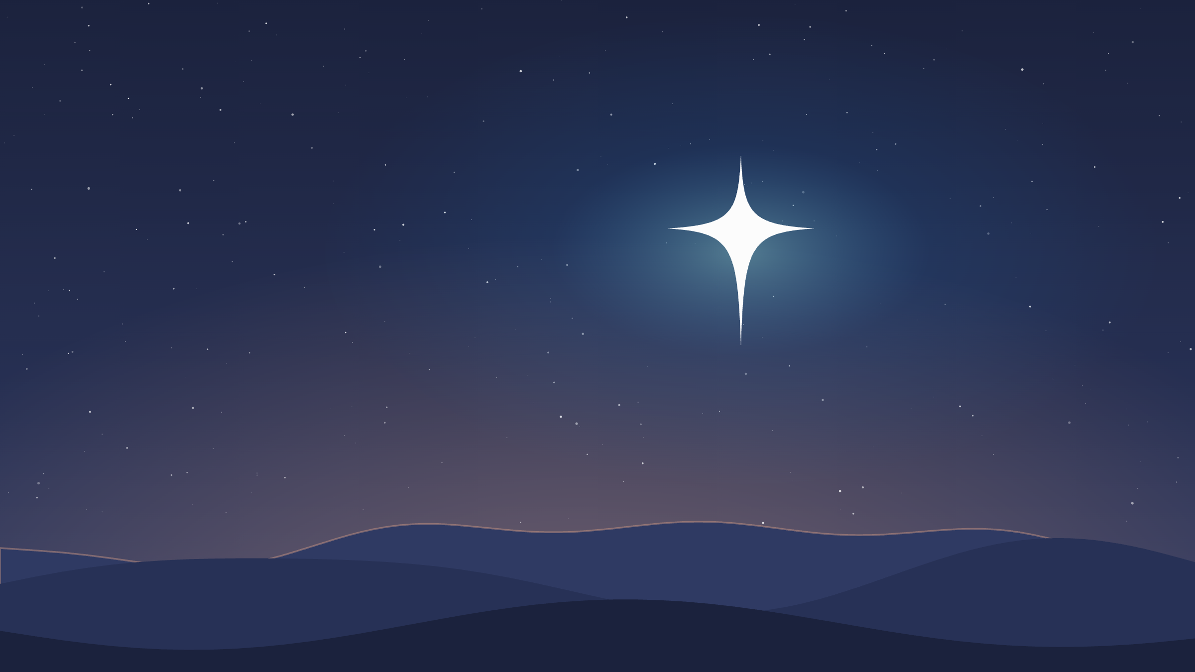
Night is a subtle vertical blend from Midnight 95 to Midnight 80. It is the default for dark covers, wallpapers and slides, usually with the star and a faint Dawn glow on the horizon.
Patterns
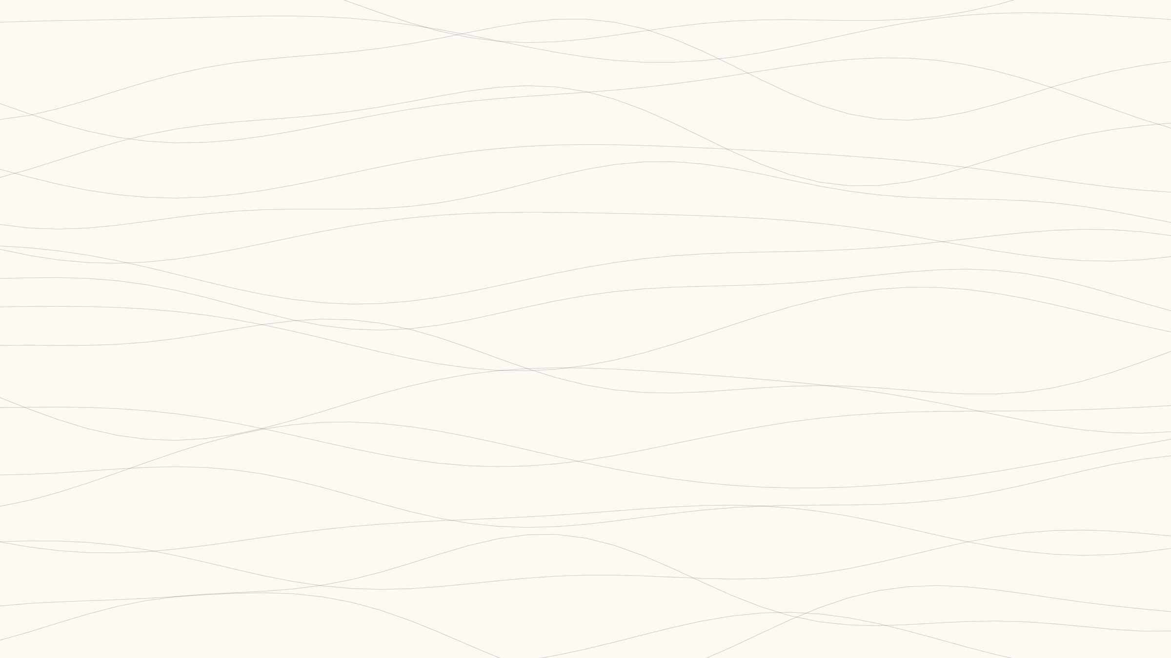
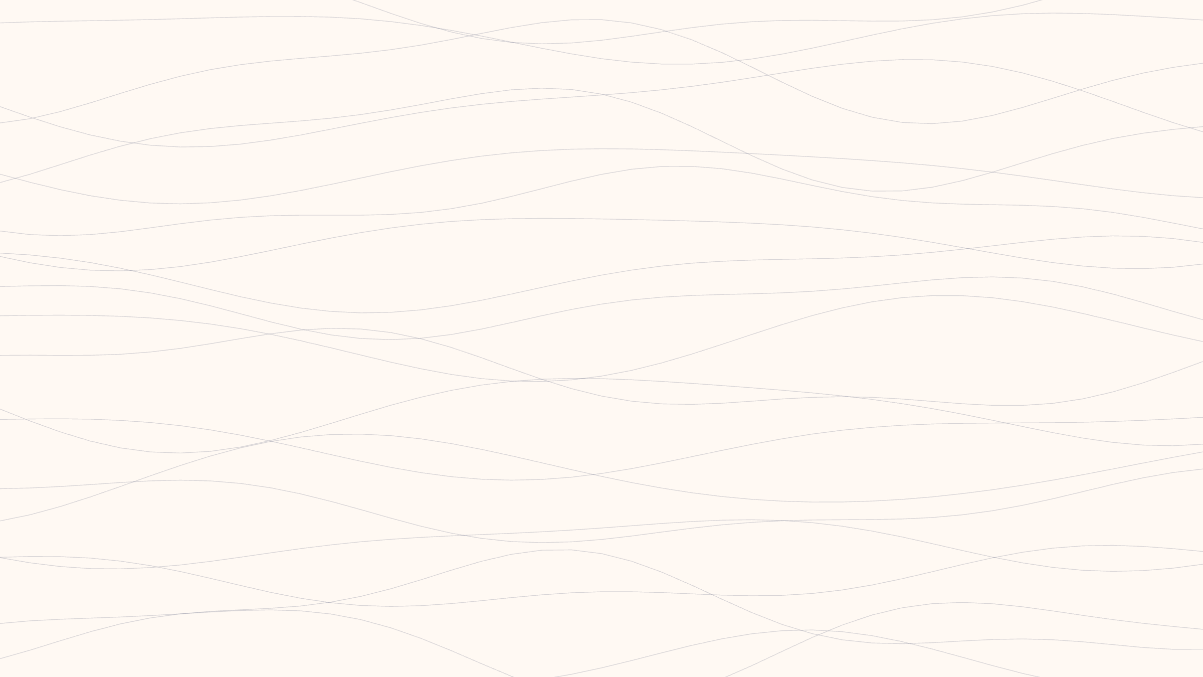
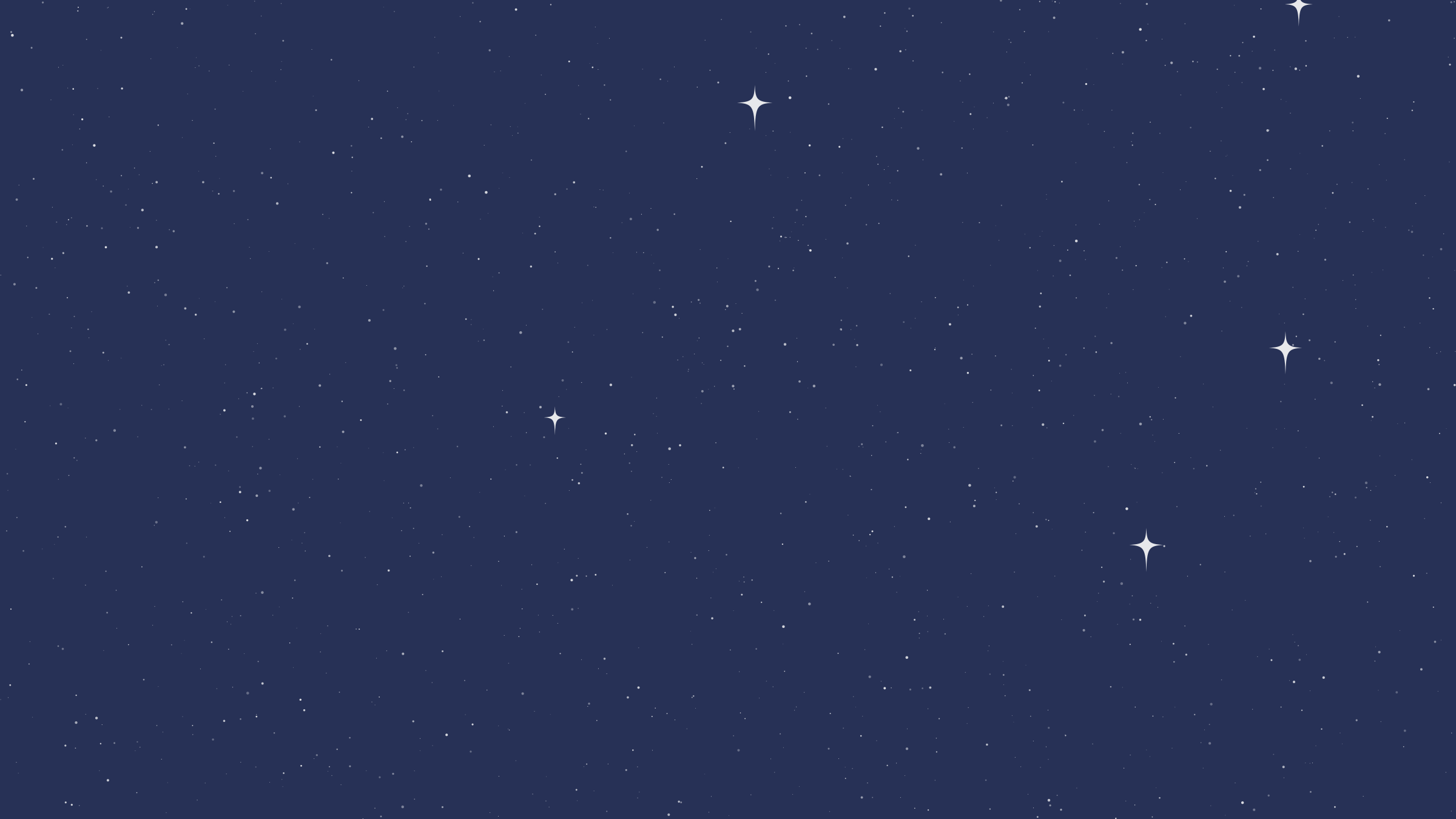
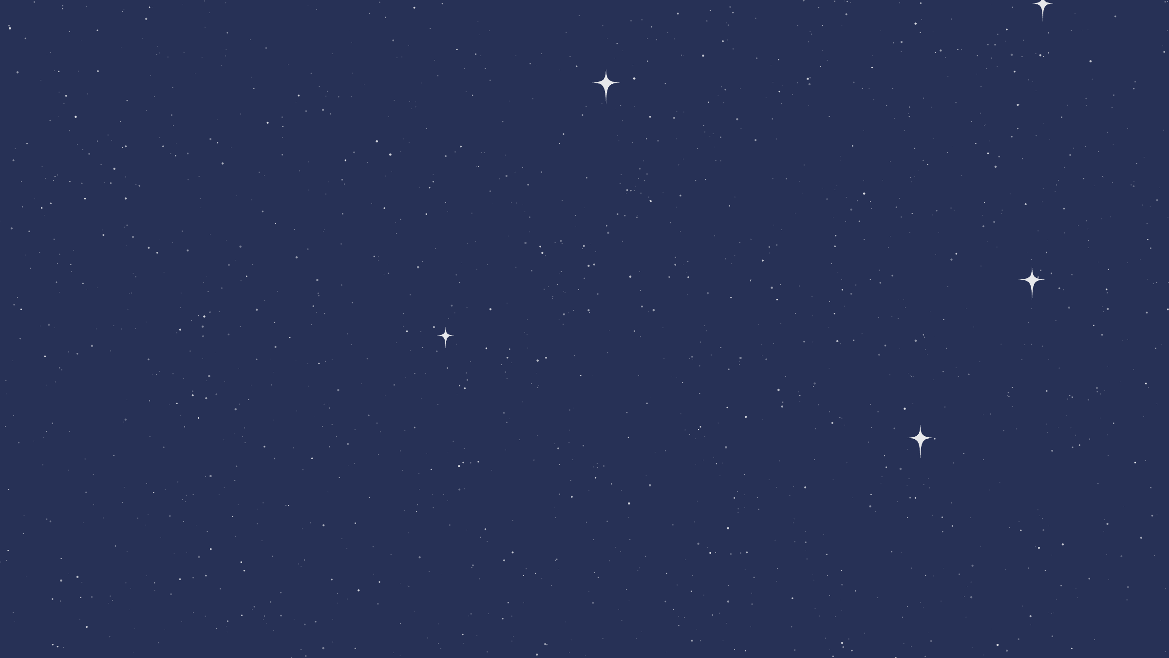
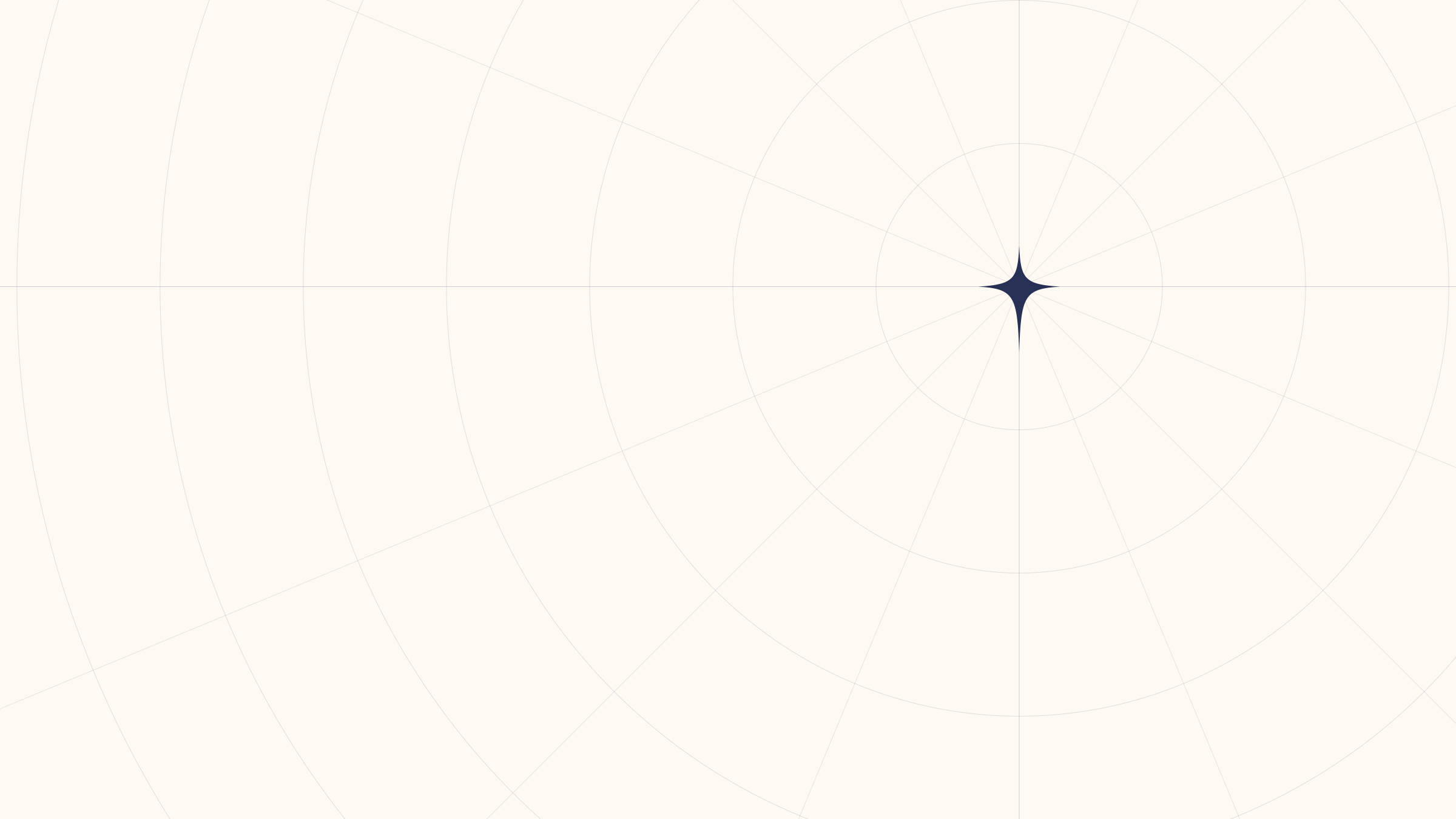
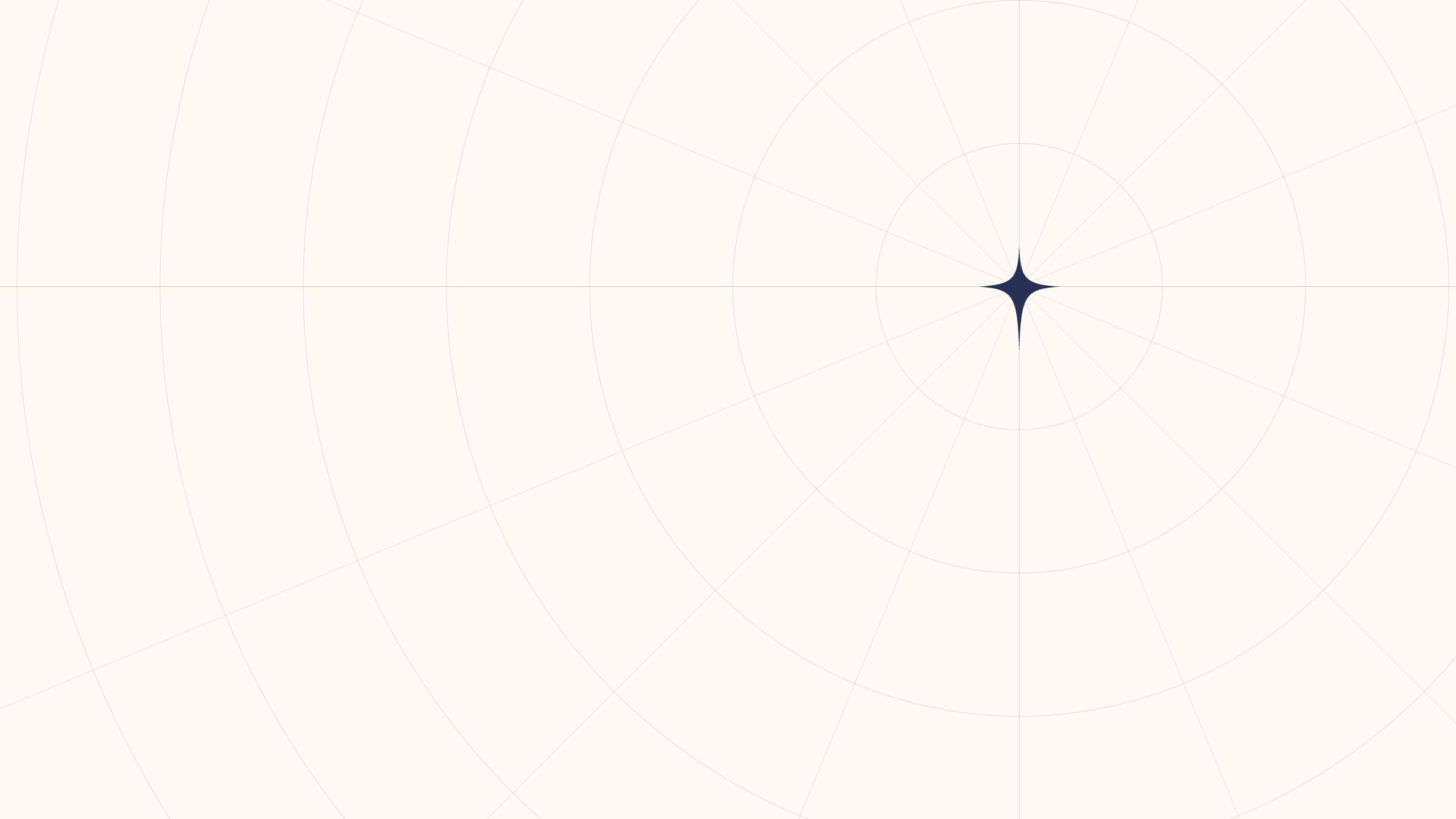
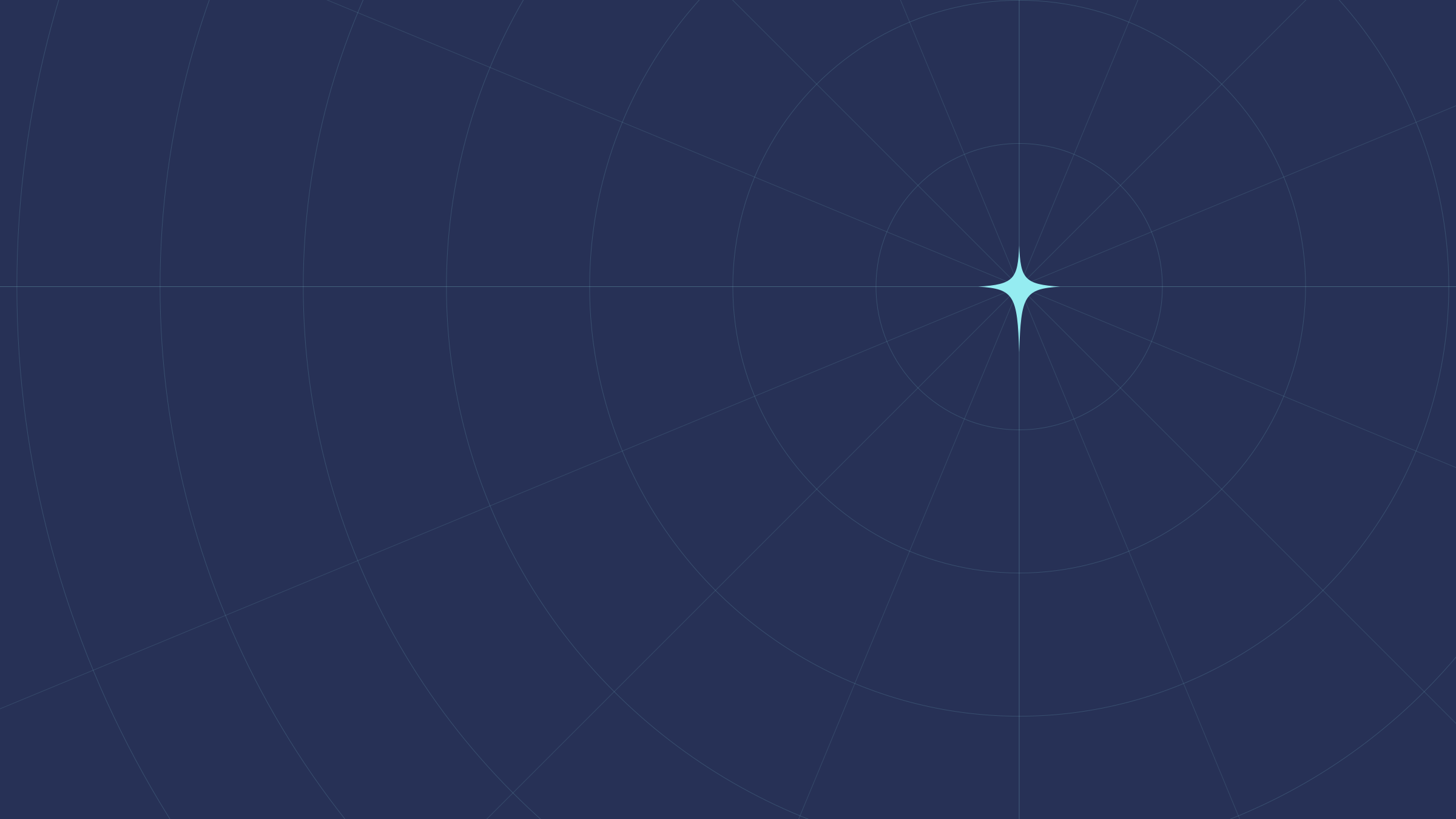
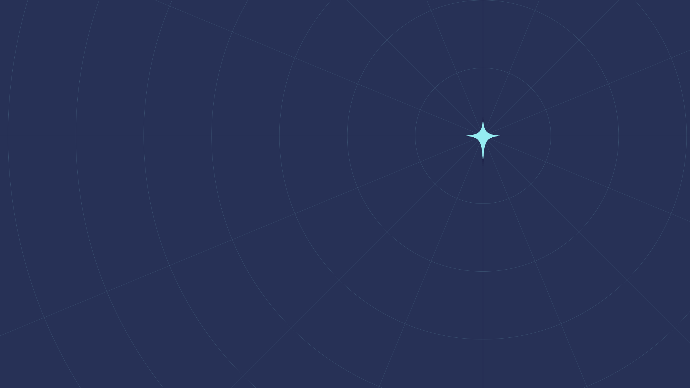
Patterns add texture to quiet areas: slide backgrounds, document covers, event walls, packaging. Each comes in a Dune and a Midnight version. All are generated from code, so they scale to any size.


Dos and don'ts
Do
- Use one gradient or pattern per layout.
- Keep text on calm, even areas.
- Use Aurora in light mode and Night in dark mode.
- Use the supplied artwork or the token values.
Don't
- Invent new gradients or add colours to them.
- Put Horizon behind body text.
- Combine a pattern with a gradient and a photo.
- Use rainbow, neon or metallic gradients.
Text lost among stars and detail
Last updated on 14 October 2026