

Logo
Looks simple. Says a lot.
Our logo is a word and a star. The word is our name, set in heavy, wide capitals that feel engineered and steady. The star is the one you navigate by.
The four-point star sits above the N like the Pole Star over the horizon. It is a promise to our customers: a fixed, trustworthy point of reference in a fast-moving, noisy field. Its long lower point reaches down towards the ground, towards the work, because we build for real places and real people.
Every North brand carries the same star, so wherever you see it, you know who is behind the product.
Anatomy
Wordmark, star and icon
- Wordmark. Custom-drawn capitals. The O is an open ellipse; the R and T are cut square. Never retype it.
- The North star. Four points, concave sides, a long lower point. Always above the N, always the same size relative to it.
- Icon. The N and the star on their own. Our shortest signature.

 StarWordmark
Logo versions
We use two versions of the North logo, depending on the space, the format and how well the audience already knows us.
When to use the full logo
- Our primary logo: use it most of the time.
- Campaigns, ads and hero visuals.
- Website headers, emails and other owned spaces.
- Press, events, presentations and signage.
- Anywhere the logo sits alongside other brands.
- First contact with audiences who don't know us yet.
When to use the icon
- App icons, favicons and avatars.
- Product UI where the full name already appears nearby.
- Small or square spaces: badges, stickers, merch details.
- As the anchor of sub-brand and product lockups.
- Second and later frames of a sequence where the full logo already appeared.
Logo colors
Midnight on light, Snow on dark
Consistent logo colours make us easy to recognise.
- Use the Midnight logo on white, Dune and light Aurora backgrounds. This is the default.
- Use the Snow logo on Midnight, photography and dark backgrounds.
- The Snow logo with an Oasis star is our signature on Midnight. Use it for hero moments, covers and the product splash.
- Use black or white only for one-colour print, embossing, engraving and partner materials that require it.

Logo over images
Find the calm area
When the logo sits on an image or illustration, place it over the darkest or lightest calm area, away from detail and texture. Choose Snow on dark areas and Midnight on light ones.
If no calm area exists, move the logo off the image onto a solid band, rather than adding a box or shadow behind it.
Clear space
Give the logo room to breathe
Clear space keeps type and graphics from crowding the logo. Measure it with x, the height of the letters in NORTH (the cap height, not including the star).
- Full logo: at least 0.5x on every side.
- Icon: at least 0.5x of the N height on every side.
- Lockups: the same 0.5x, measured from the icon's N.
- More is always better. On covers and posters use at least 1x.
xDashed area: 0.5x clear space. x = cap height of NORTH.
Logo placement
The logo can sit in any corner or in the centre, as long as it feels intentional, is easy to spot and doesn't compete with the message.
Minimum logo size
Don't go too small
Below the minimum size the star loses its shape and the wordmark fills in. When in doubt, go bigger.
88px 20px
20px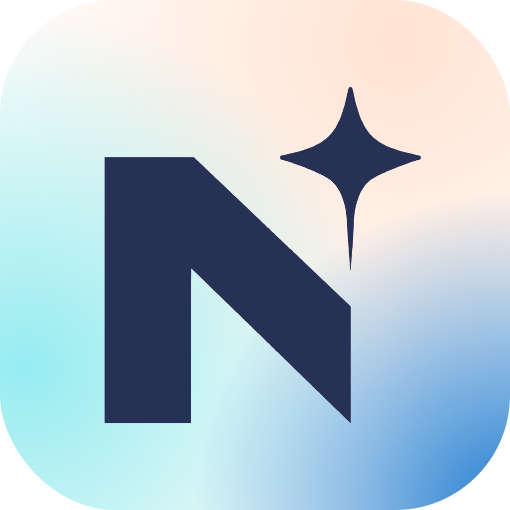 16px
16px| Version | Digital | |
|---|---|---|
| Full logo | 88px wide | 22mm wide |
| Icon | 20px high | 6mm high |
| Lockups | Icon at 24px high | Icon at 7mm high |
| App icon / favicon | 16px (use the app tile) | n/a |
Do's and don'ts
Follow these rules to keep the North logo consistent and recognisable.
Do
- Use the logo exactly as supplied, from this hub.
- Use Midnight on light and Snow on dark.
- Choose the version that reads best in the space.
- Keep it at 100% opacity, in approved colours only.
- Always keep the star with the wordmark.
Don't
- Redraw, retype, rotate, distort or rearrange it.
- Recolour it outside the approved colourways.
- Add effects, outlines, gradients or transparency.
- Place it on busy imagery or in low contrast.
- Lock it up with taglines or other words, except in approved lockups.
SOVEREIGN AI
Download the North logo
Get the official logo files for digital, print and presentations: SVG for anything that scales, PNG for documents. Sub-brand, product and enabler logos are on the Logo lockups page and in the asset library.
Last updated on 14 October 2026