

Illustration
Hand-printed, not machine-made
Our illustrations look like linocut prints: carved lines, inked by hand, on warm paper. They bring craft and calm to a subject that is usually shown as glowing blue circuitry.
The style started in the NorthStar Help Center, where each guide opens with a printed scene. It works because it is the opposite of what people expect from AI: tactile, human and rooted in place. Falcons, dunes, sunrise, the star — the vocabulary of the Gulf, not of science fiction.
What makes it North
Five ingredients
- Linocut line. Bold carved outlines and hatching; no smooth vector strokes.
- A limited palette. Midnight ink, Dawn peach, Oasis aqua and Gulf blue on Dune paper. Nothing else.
- Visible texture. Ink grain, slight misregistration, paper fibre.
- One subject. A single clear idea per scene, centred with room around it.
- Regional, timeless imagery. Desert, sea, sky, falcons, dhows, the star. Technology appears as simple objects.
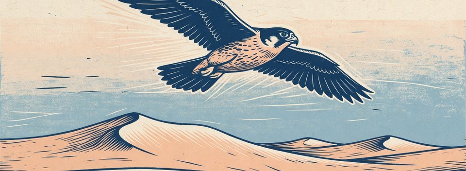
Library
Use illustrations from the library. Each one has a meaning; match the scene to the subject.
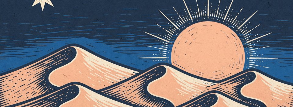
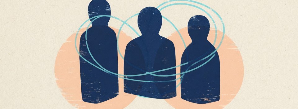
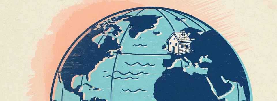
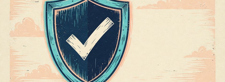
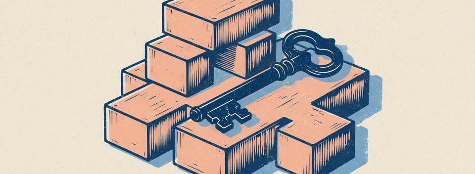
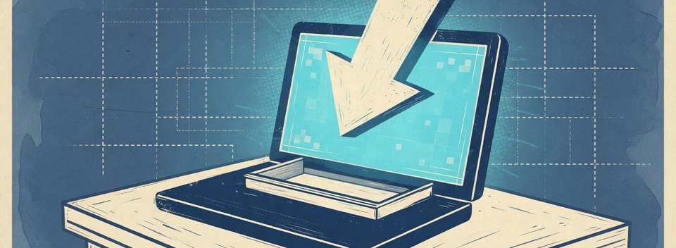
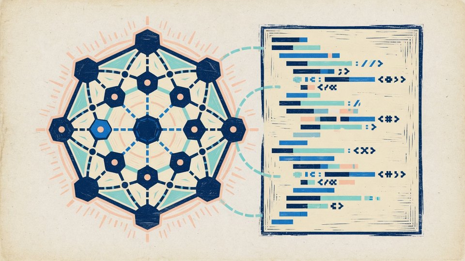
Where to use illustration
- Documentation and help-centre headers (16:6 banners).
- Empty states, onboarding and error pages in product.
- Article, newsletter and report covers.
- Section openers in presentations (image and text layout).
- Event signage and printed materials, where the texture shines.
Commissioning new illustrations
Brief artists, or prompt carefully
New scenes should be indistinguishable from the library. Brief an illustrator with the five ingredients above and two reference images. If you use an image-generation model, start from the prompt below, generate many, and choose only those that match. Every new illustration is approved by the brand team before use.
Never use AI-generated people as if they were real customers or staff.
Linocut print illustration of [ONE SUBJECT, e.g. "a dhow
sailing towards a four-point star at dawn"].
Hand-carved lines, visible ink grain and slight misregistration,
printed on warm cream paper (#FFF9F3).
Strictly limited palette: deep navy ink (#273156), soft peach
(#FFE3D3), aqua (#95ECF1), medium blue (#227ED1).
Single centred subject, calm composition, generous empty paper
around it. Flat lighting, no gradients, no glow, no text,
no letters, no logos. Wide banner, 16:6.
Dos and don'ts
Do
- Use library scenes that match the subject.
- Give illustrations space; let the paper breathe.
- Crop to the banner format without cutting the subject.
- Pair them with short, calm headlines.
Don't
- Recolour, add gradients or apply filters.
- Mix with 3D renders, stock vectors or icon-style illustrations.
- Put body text over the illustration.
- Use clichés: glowing brains, robot hands, hooded hackers.
- Crop through the subject.
Agents plan, call tools in loops and sometimes delegate to sub-agents.
Last updated on 14 October 2026